Editor panels
The icons down the left edge of the editor open panels. This page lists what is there now and what each one is for.
The panels
| Panel | What it does |
|---|---|
| Add node | The node picker — also opened by the green button in the graph header. |
| Components | The project's component tree and sheet list. |
| Search | Project-wide search over nodes and their properties. |
| Maths RGS | Connect to the RGS platform; author, deploy, simulate and certify maths components. See XGENIA RGS. |
| AI Image Editor | Generate and compose images, video and audio. See AI Image Editor. |
| Chat | The AI assistant. See AI Agents. |
| Version control | Git: commit, push, pull, branches — and publishing to GitHub. See Version control. |
| Project Styles | The visual direction the AI follows when it generates images for this project. |
| Feedback | Report a bug or send feedback. |
| Settings | Project and editor settings, as two tabs of one panel. |
Add node
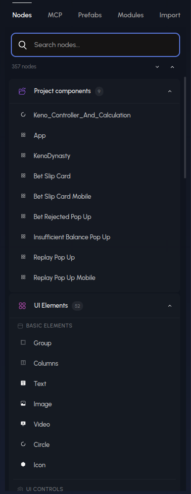
Search, or browse by group: Project components first, then the built-in library. Click a node to add it. The tabs along the top switch to MCP tools, Prefabs, Modules and Import.
Components
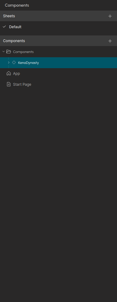
Sheets group components; Components is the tree. The house icon marks the home component — the one the app starts on. Right-click or use the ⋯ menu on a component to rename, duplicate, delete or make it home. The + buttons create a sheet, a component or a folder.
Search
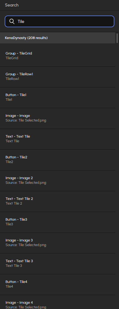
Results are grouped by component and list the node type, its label and the matching property. Click a result to jump to the node. Ctrl+F opens this panel with the search box focused.
Maths RGS
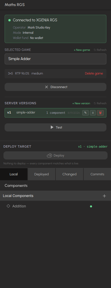
Your connection to the platform, the selected game, its server versions, and the maths components as source control: Local, Deployed, Changed and Commits. The whole panel is documented under XGENIA RGS.
Version control
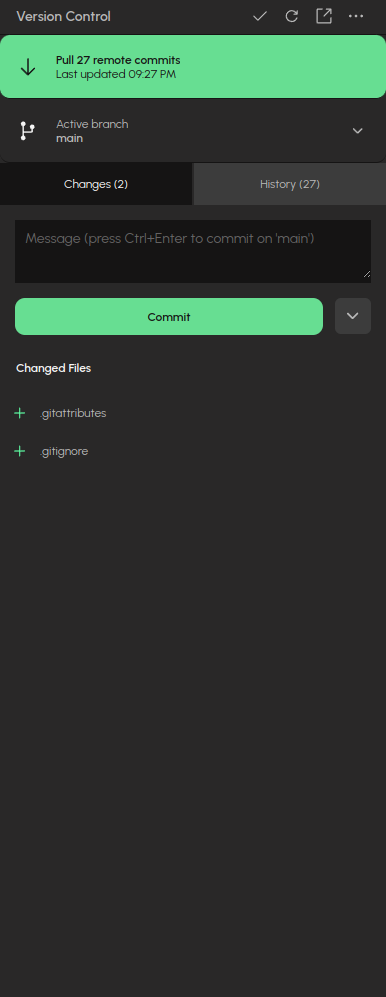
The status button at the top always shows the next sensible action — here Pull 27 remote commits. Below it: the active branch, the Changes and History tabs, and the commit box.
Project Styles
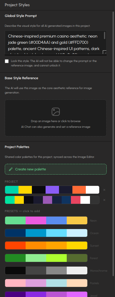
Three things the AI reads before it generates any image for this project: a Global Style Prompt (lock it so the AI cannot change it), a Base Style Reference image, and the project's Palettes, which are shared with the Image Editor. Presets give you a palette in one click.
Settings
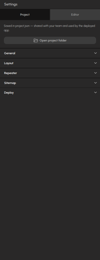
The Project tab is saved in the project and shared with your team: General, Layout, Repeater, Sitemap and Deploy sections, plus a button that opens the project folder on disk.
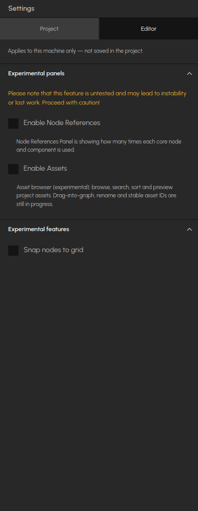
The Editor tab applies to this machine only — see Experimental panels below.
Properties and Ports
Properties and Ports appear on the right when you select a node or edit a component's ports. The Properties panel is resizable: drag its left edge, double-click the edge to reset. The width is remembered.
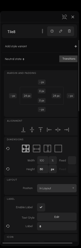
You can also select a node by clicking its element in the preview while in Edit mode — see Editing in the viewport.
Documents in the main area
Most of the main area shows the node graph, but some features open a document of their own there. Each has an Exit button top-right that returns you to the graph.
- Component diff — a component compared against another version of it.
- Deployed maths component — the graph of a component exactly as it runs on the platform, read-only.
- Maths simulate — the simulation view for a deployed component.
- Maths compliance — the certification and compliance documents for a deployed component.
Experimental panels
Two panels are off by default. Enable them under Settings → Editor → Experimental panels:
| Panel | What it does |
|---|---|
| Assets | Browse, search, sort and preview the project's assets. Drag-into-graph and rename are still in progress. |
| Node References | Counts how often each node and component is used in the project. |
The same Settings tab has an Experimental features section for editor behaviours (currently Snap nodes to grid). Everything on the Editor tab applies to this machine only — none of it is saved in the project or shipped with your app.
Interface zoom
The whole editor interface can be scaled from the View menu (Ctrl+Plus, Ctrl+-, Ctrl+0), between 50% and 200%. The preview keeps its own zoom. The setting is remembered between sessions.
Gone from the sidebar
If an older guide or video mentions these, here is where they went:
| Panel | Status |
|---|---|
| Cloud Functions | Superseded by Maths Components — backend logic is authored under the maths sheet and deployed to the RGS platform. |
| Cloud Services | Withdrawn together with Cloud Functions. Environments already stored in a project still work and still appear in the "Connected cloud services" dropdowns on the Self Hosting and Deploy to Stake tabs. |
| Memory | Not registered. |
| File Explorer, Design Tokens, Undo Queue | Removed — unfinished development mockups that never shipped in packaged builds. |
| AI menu (menu bar) | Removed. Open the AI settings from the gear in the Chat panel instead. |
With Cloud Functions gone, cloud-function components currently have no panel in the editor. The Cloud Logic and Cloud Data guides still describe how those features work.