XGENIA Slot Template Layout
This section explains the visual structure and organization of the XGENIA Slot Template, showing how each layout element works and connects to create the complete slot game interface.
Layout Overview
The game's layout is built upon a hierarchy of nested visual groups. This structure allows for precise control over the positioning and layering of different UI elements, from the background image to the interactive buttons and the central slot machine display.
Initial View
The initial view presents all the essential game information and controls to the player in a clear and organized manner, ensuring an intuitive user experience from the start.
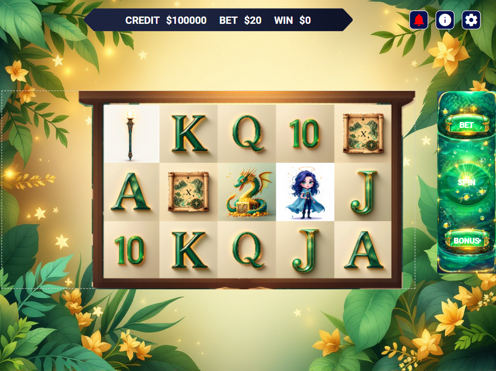
Main Screen Elements
The visual architecture is composed of several key elements that create the complete game screen. Each element has a specific purpose and connects with others to form the complete interface.
1. Main Container
Purpose: Acts as the foundational layer that encompasses the entire visible game area and provides the coordinate system for all child elements.
Connections Flow:
- From Game Configuration → Receives viewport dimensions and positioning data
- To All Child Elements → Provides container bounds and coordinate system
- To Background Image → Provides sizing constraints for proper scaling
- To Layout Groups → Establishes positioning framework for all UI sections
How it Works: The Main Container automatically detects the device screen size and creates a responsive viewport that scales appropriately. It serves as the foundation layer that all other visual elements position themselves relative to, ensuring consistent layout behavior across different devices and screen orientations.
Customization Options:
- Change background color to match your theme
- Adjust overall size and positioning
- Add custom styling for unique visual effects
2. Background Image
Purpose: Sets the visual theme and atmosphere by displaying the main background artwork behind all other UI elements.
Connections Flow:
- From Get Config JSON → Receives BackgroundURL (example:
slot_classic_01/background.png) - From Download Background → Receives processed image data
- From Main Container → Gets sizing and positioning constraints
- To Image Component → Displays background with proper scaling and positioning
Customization Options:
- Replace with your own background images
- Use different backgrounds for different game themes
- Add animated backgrounds for dynamic effects
- Adjust how the image scales and fits the screen
3. Header Information
Purpose: Displays critical game information at the top of the screen, providing players with essential data at a glance.
Connections Flow:
- From Get Session → Receives player Balance (example: 1000 credits)
- From Bet Transactions → Receives current Bet Amount (example: 10 credits)
- From Bet Transactions → Receives Total Win amount (example: 50 credits)
- To Text Components → Updates CREDIT, BET, and WIN displays in real-time
- To Header Layout → Positions information for optimal visibility
How it Works: The Header Information section automatically updates whenever game data changes. It uses data binding to reflect real-time values, so when a player spins, the balance and win amounts update instantly. The layout is positioned prominently at the top of the screen for easy visibility without obstructing the main game area.
Information Displayed:
- CREDIT: Current player balance
- BET: Current bet amount per spin
- WIN: Total winnings from the last spin
Customization Options:
- Change text labels and fonts
- Adjust colors and styling
- Add additional information like multipliers or bonus points
- Modify positioning and size
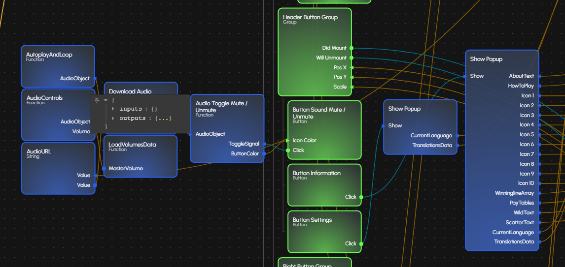
4. Header Control Buttons
Purpose: Provides access to non-gameplay options and settings, conveniently located in the top-right corner for easy access.
Connections Flow:
- From Audio Manager → Sound Button receives current audio state
- To Audio Manager → Sound Button sends mute/unmute commands
- To Popup System → Info/Settings buttons trigger modal displays
- From Game Settings → Receives current configuration states
- To UI State Manager → Updates button visual states and interactions
Button Functions:
- Sound Button: Controls audio on/off state
- Info Button: Opens game rules and paytable information
- Settings Button: Opens game configuration and preferences
- Spin Mode Toggle: Switches between API and Local TRNG generation (if enabled)
Customization Options:
- Change button icons and colors
- Adjust button sizes and positioning
- Add or remove buttons based on your needs
- Modify button styling and effects
- Configure spin mode availability and default settings
Key Feature: Header Button Group This group contains the main utility buttons: settings, information, and mute/unmute. These buttons provide quick access to non-gameplay features and are visually grouped for user convenience.
5. Game Action Buttons
This group contains the primary game interaction buttons, positioned for easy access on the right-hand side.
- Purpose: To provide the main gameplay controls: placing a bet, spinning the reels, and accessing bonus features.
- What you can customize:
- Change button labels and styling
- Adjust button sizes and positioning
- Modify button colors and effects
- Add hover and press animations
- Child Elements: Includes buttons for
Bet,Spin, andBonus.
Key Feature: Action Buttons This group includes the main action buttons: BET, SPIN, and BONUS. The SPIN button triggers the main game logic, while BET and BONUS provide additional gameplay options.
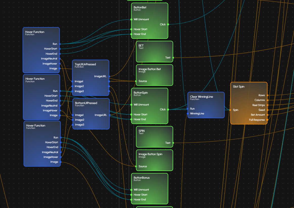
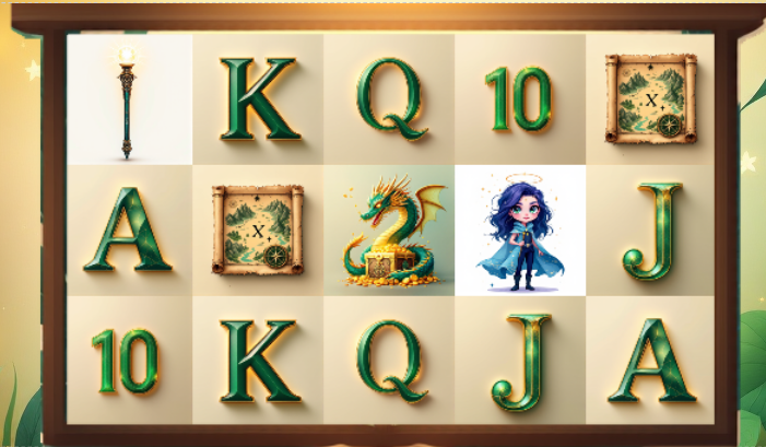
6. Slot Machine Display
This is the visual centerpiece of the game, where the action happens.
- Purpose: To contain the slot reels and their decorative frame, drawing the player's focus to the game's outcome.
- What you can customize:
- Replace slot symbols with your own icons
- Change the grid layout (more or fewer reels/rows)
- Customize the frame design to match your theme
- Add special effects and animations
- Child Elements:
- Icon Grid: This area dynamically generates the grid of slot icons, creating the animated reel effect.
- Frame Overlay: The decorative border that overlays the reels, enhancing the slot machine theme.
Key Feature: Slot Frame The Slot Frame is the main area where the slot icons are displayed and animated. It uses a dynamic icon repeater and overlays a decorative frame image for a classic slot machine look.
Layout Responsiveness
The layout is designed to be responsive and work across different screen sizes:
Desktop Experience
- Full viewport utilization with proper spacing
- All elements are clearly visible and accessible
- Optimal button sizes for mouse interaction
- Professional gaming interface
Mobile Experience
- Elements scale appropriately for touch interaction
- Header information remains readable
- Action buttons are sized for comfortable thumb navigation
- Touch-friendly interface design
Tablet Experience
- Balanced scaling between desktop and mobile
- Maintains visual hierarchy while optimizing for touch
- Comfortable viewing and interaction on medium screens
Visual Hierarchy
The layout follows a clear visual hierarchy that guides the player's attention:
- Background Layer: Sets the overall theme and atmosphere
- Information Layer: Header displays critical game data
- Control Layer: Action buttons for game interaction
- Game Layer: Slot frame with animated icons
- Utility Layer: Settings and information buttons
This hierarchy ensures that players can quickly understand the game state and take appropriate actions without confusion.
Understanding the Component Structure
The components are organized in a logical hierarchy that makes the game easy to understand and customize:
Main Container (Group)
├── Background Image
├── Header Group
│   ├── Header Text Group
│   │   ├── Header Image
│   │   ├── CREDIT Text
│   │   ├── Balance Text
│   │   ├── BET Text
│   │   ├── Bet Amount Text
│   │   ├── WIN Text
│   │   └── Total Win Text
│   └── Header Button Group
│       ├── Sound Button
│       ├── Info Button
│       └── Settings Button
├── Right Button Group
│   ├── BET Button
│   ├── SPIN Button
│   └── BONUS Button
└── Slot Frame Group
    ├── Icon Group
    │   └── Icon Image
    └── Frame Group
        └── Frame Image
How to Work with the Layout
Understanding the Structure
- Each section has a specific purpose and can be customized independently
- The layout uses a logical flow from top to bottom, left to right
- All elements are positioned to create an intuitive user experience
Making Layout Changes
- Identify the section you want to modify
- Understand its purpose in the overall design
- Make targeted changes without affecting other elements
- Test the changes on different screen sizes
Best Practices for Layout Modifications
- Keep the visual hierarchy intact
- Maintain proper spacing between elements
- Ensure all interactive elements are easily accessible
- Test responsiveness across different devices
- Consider the user's natural reading and interaction patterns
Additional Pages
The application includes several specialized pages that extend the template's functionality beyond the main slot game interface:
Start Page
- Purpose: Main landing page containing the complete slot game interface
- Components: All primary game elements including header, buttons, slot frame, and audio controls
- Function: Serves as the central hub for gameplay and primary user interaction
Templates Page
- Purpose: Collection of reusable game templates and component libraries
- Content: Pre-built layouts, UI components, and design patterns
- Usage: Accelerates development by providing ready-made elements for customization
Toolkit Pages
Advanced utility pages providing comprehensive development tools:
Math and Logic Toolkit (/Toolkit/Math and Logic)
- Random Number Generators: Float generation for Local TRNG mode
- Value Processing: Clamp Number, Modulo operations for bet validation
- Animation Functions: Easing curves (linear, easeInOutSine) for smooth transitions
- Geometric Calculations: Distance calculation for touch interactions
- Color Operations: Blend functions for winning effect animations
- Conversion Utilities: Degrees/Radians conversion for rotational effects
- Mapping Functions: Value range mapping for progress bars and scaling
String Data Manipulations (/Toolkit/String Data Manipulations)
- Array Processing: Flatten, shuffle, sample, intersection, union operations
- Object Manipulation: Clone, merge, pick, omit, map keys/values
- String Operations: Word count, character count, slugify, HTML escape/unescape
- Data Validation: Array/object validation and type checking
- Text Processing: Reverse words, pad start, repeat functions
- Advanced Operations: Group by, sliding window, transpose for complex data handling
Utility and Helpers (/Toolkit/Utility And Helpers)
- Validation Suite: Email, URL, number, integer, boolean validation
- Security Functions: UUID generation, MD5/SHA256 hashing, Base64 encode/decode
- Browser Integration: Cookie management, local storage, clipboard operations
- DOM Utilities: Element positioning, scroll control, class toggling
- File Operations: Download functions, file extension detection, size validation
- Performance Tools: Memory management and resource optimization
- JSON Processing: Safe parsing/stringify with comprehensive error handling
Integration Benefits
These toolkit pages provide:
- Modular Development: Use only the functions you need for your specific game
- Code Reusability: Pre-tested functions reduce development time and bugs
- Performance Optimization: Efficient algorithms for common gaming operations
- Security Features: Built-in validation and sanitization for user inputs
- Cross-Platform Compatibility: Functions work consistently across different devices and browsers
Development Workflow
The additional pages support a streamlined development process:
- Start Page: Test and play your slot game
- Templates: Choose base layouts and components
- Toolkit: Access utility functions for advanced features
- Integration: Combine elements to create custom gaming experiences
These pages are designed to work together to provide a complete development ecosystem while maintaining consistent design principles and user experience standards.