Text Input
This node places a text input field in the visual tree. The input can be used to capture information from a user.

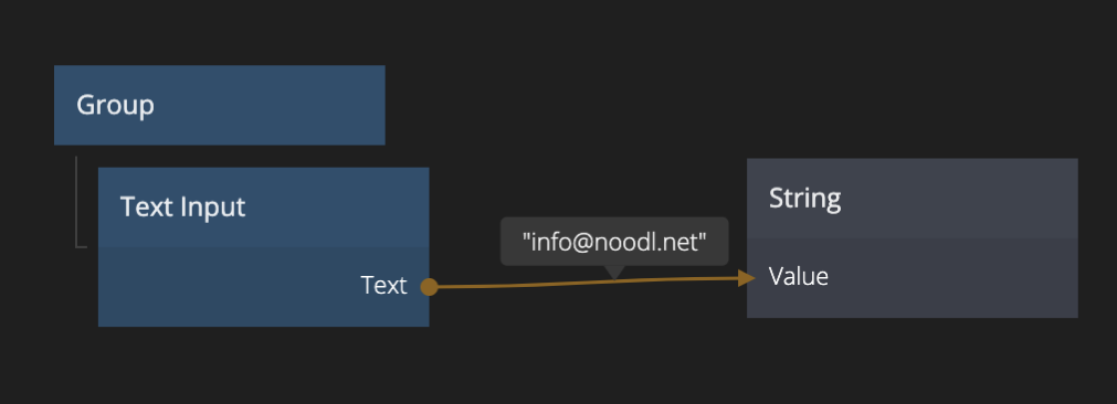
The captured value can easily be connected to other nodes in a project.
Inputs
| Data | Description |
|---|---|
| Text | The text string of the Text Input node. Setting this will change the current text, unless Set is connected, then it will be updated when Set receives a signal. |
| Type | The type of the Text Input.Text: A single line text input (default).Text Area: A multi line text input.Email: A single line email text input.Number: A single line number input.Password: A single line password input, will mask password by default. |
| Placeholder | The placeholder text for when the Text Input is empty. |
| Placeholder Opacity | The opacity of the placeholder text. 0 is completely transparent and invisible. 1 is completely solid and opaque. |
| Text Alignment | The alignment of the text string within the Text Input node's bounding box. |
| Signal | Description |
|---|---|
| Set | Sets the text field value to the text in the Text input. |
| Clear | Clears the text. |
| Focus | Focuses the text field. Note: Some browsers, most notably Safari, only allow focus if it originates from a user event, like a click. So using a Delay node or other method might not work. |
| Blur | Removes the keyboard focus. |
Visual
This node supports the following Visual Input Properties:
- Margin
- Padding
- Alignment
- Dimensions
- Layout, Position
- Text Style
- Style
- Border Style
- Corner Radius
- Box Shadow
- Placement
- Other
- Advanced HTML
Outputs
| Data | Description |
|---|---|
| Text | The current text string. |
| Signal | Description |
|---|---|
| On Enter | Signal triggered when Enter/Return key is pressed. |
It also features the standard set of UI control signals:
@include "../../shared-props/outputs/_control-events.md"
States
Apart from triggering signals the Checkbox node also notifies of its state through data outputs:
@include "../../shared-props/outputs/_control-states.md"
Visual
This node supports the following Visual Output Properties:
@include "../../shared-props/inputs/_visual-input-properties.md"
@include "../../shared-props/outputs/_visual-output-properties.md"