Slider
This node places a range slider in the visual tree. It is used to select a number between a min and a max value.

The Slider node allows you to set a Step value. This controls in what intervals the slider can be incremented or decremented.
Inputs
| Data | Description |
|---|---|
| Value | Sets the numeric value of the control. |
| Min | Sets the numeric minumum value that can be selected using this range control. Default is 0. |
| Max | Sets the numeric maximum value that can be selected using this range control. Default is 100. |
| Step | Sets the numeric step value for this range control. Values can only be selected in the specified steps. Default is 1. |
It can be enabled and disabled using the Enabled input:
@include "../../shared-props/inputs/_enabled.md"
Thumb and track
The Property Panel features editing popouts for the Slider Thumb and Track. These are styled separately using modified versions of the Dimensions, Border Style, Corner Radius and Box Shadow gadgets.
Visual
This node supports the following Visual Input Properties:
Outputs
| Data | Description |
|---|---|
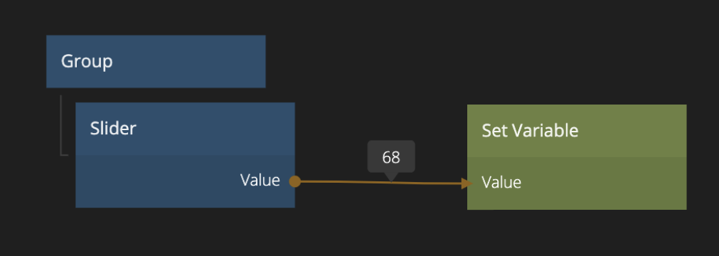
| Value | The current selected numeric value of the range control. |
| Value Percent | The current selected numeric value of the range control adjusted to be between 0 and 100, so the value of the range control in %. |
@include "../../shared-props/outputs/_control-events.md"
States
The Slider
@include "../../shared-props/outputs/_control-states.md"
Visual
This node supports the following Visual Output Properties:
@include "../../shared-props/inputs/_visual-input-properties.md"
@include "../../shared-props/outputs/_visual-output-properties.md"